
Mobile traffic makes up 52.99 percent of all global web traffic.
Amazing statistic right? What's even more amazing is that this percentage from the third quarter of 2017 presents a growth since the corresponding quarter of 44.69 percent from the previous year.
Web professionals are already aware of the importance of building a mobile responsive website, but the problem is that it doesn't end when the initial web design of the website is finished.
Why buying a responsive theme is not enough
Most businesses need to keep producing new content to stay ahead of the game. New blog posts, landing pages, or homepage redesigns are a recurring thing in every office, so the most efficient and fastest workflow of mobile responsive web design needs to develop in order to save precious capital and time.
In this post, I will share seven steps you can follow to make sure your website is 100 percent mobile responsive.
Our own designers have used these mobile website tips to create professional templates and landing pages used by hundreds of thousands of people.
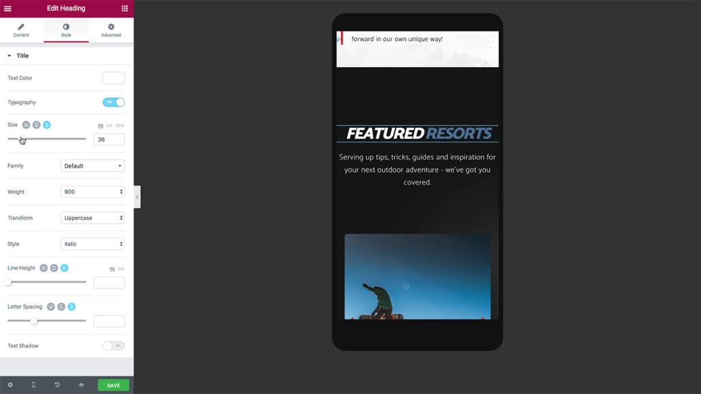
1. Fix typography for mobile
We start our process by going over each and every text element on the page. What is a mobile responsive website? Each headline, text editor, and other text elements get the proper adjustment so it fits the corresponding desktop, tablet, and mobile screen sizes.
Here are best practices regarding mobile typography you should make sure you follow:
- Always maintain the right headline hierarchy. The transition to mobile often requires the reduction in the size of the headline. When you reduce the size, however, you need to make sure you keep the proper size hierarchy of the headlines. This means H1 headlines are bigger than H2, H2 bigger than H3, and so on. All headlines should be proportional one to the other (All H2 headlines for example) and should be larger than the body text below them.
- While it is true that you will frequently reduce the size of headlines to get them to look proportional on mobile, you have to remember an important rule of thumb. The human vision has its physical limitation, and so the body text cannot be proportionally reduced below a certain threshold, which is usually 14 pixels. The headlines above the body text should keep both the proportion of the other headlines and the proportion of the text below them, so make sure they are bigger than the body text.
2. Edit padding and margin
After we've finished dealing with the typography, it's time to fix any spacing issue that might arise with the transition to mobile display.
Here's our list of action items:
- Content-to-screen spacing: Go over the spacing between the content and the edges of the screen, making sure the content is not too condensed together yet is not to spread out either. Our designers usually use a 20 pixel left and right margin so the content is nicely framed in relation to the screen.
- Element-to-element spacing: Some of the elements will have to be reduced in relation to one another, and the spacing in between them should also be reduced accordingly. If we take a classic two-column side-by-side section, with the image on the left and text on the right, customizing the section to mobile devices is not just a matter of reducing or enhancing one of the elements but doing so in relation to the other element.
- Column-to-column and section to section spacing: After reducing the elements to the needed sizes, we go over the spacing between columns and sections, which will also get a proportional reduction in relation to the element size reduction.
You should note that in some websites, the page elements are aligned around a certain grid. If you've used margins to move elements along the grid on desktop, the switch to mobile will require some mobile margin adjustments in order to align the elements to the new layout.
3. Change the layout to be responsive
When you make the page design adjustments for mobile you have to alter the layout of the page.
This alteration reduces the size of the elements, but often there is a limit to how much you can reduce. As the page's creator you want all elements to retain their visibility and high quality. Text should be readable and images should be of sufficient size so as not to require manual zoom in.
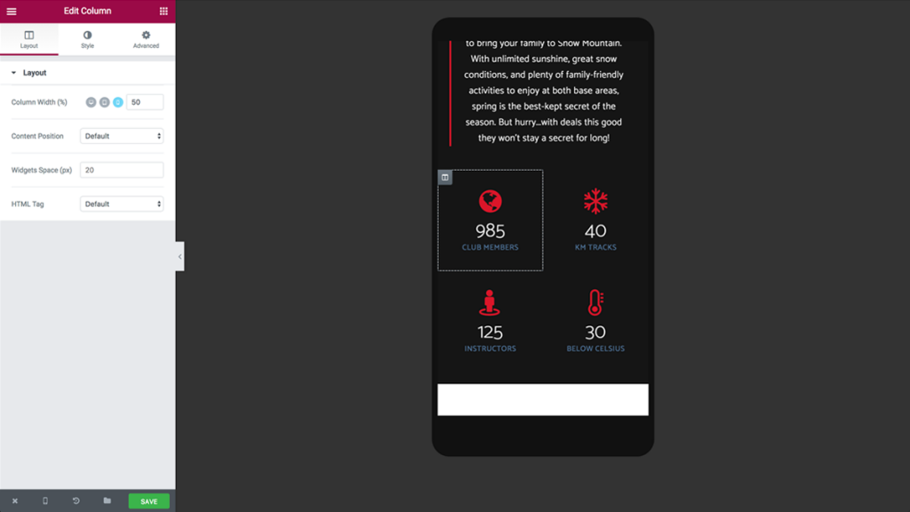
In Elementor, we've thought of an automatic solution to make the layout mobile-adaptive. We've created an alternative and automatic mobile grid that sets each column with its own row. If, for example, we have a three-column section, on mobile each of the three columns will take up the full width of the screen, and columns will be positioned one on top of the other.
Automatic responsiveness is nice, but I would suggest to always keep the ability to define your own custom widths per column. We've included this flexibility inside our own page builder, allowing you to define any width per column, set separately for desktop, tablet, and mobile.
4. Reverse columns to set the right order
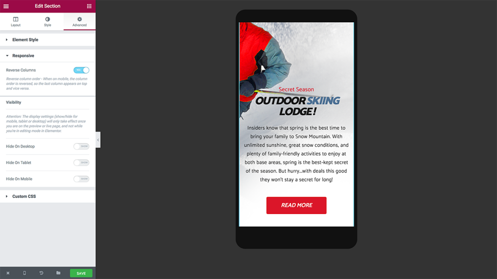
Besides margin and padding changes, the switch from desktop column layout to mobile can cause issues with the order of columns.
Let's take a classic two-column section, text on the left and image on the right. When you switch to mobile, each column will get its own row, from left to right. This will result in the text appearing above the image. To circumvent this issue you can switch the "reverse column" option, to get the image above the text.
The same technique can be used to reverse the column order of any number of columns in a section.
We've added a switch to our own page builder that allows you to reverse the mobile column order with one click.
5. Hide sections and/or widgets
The mobile version of a site often requires a more minimalistic design, with some of its elements getting simplified or even removed altogether. Besides an over-abundance of page elements, the content can also get too long on mobile, making the page scroll too long in terms of user experience.
Our team found that the best way to achieve this website simplification for mobile is by hiding specific elements of the page. This is why we've built in an option to show or hide widgets or sections from mobile, desktop, and tablet.
6. Choose from pixels/em/percentage/VH scale
Pixels, em, percentage, and VH scale are all CSS units of length (read more here to brush up on CSS and the different units of length you can use). Using different size scaling can help you make a website layout that has better adjustments to mobile devices.
Using "em" or percentage for sizes of element sizes and spacing means the design will be scalable for your visitors while using pixels allows for an easier setting of absolute sizes.
In Elementor, we've included several size options, so you can determine which unit of length you prefer.
7. Adjust page elements per device
Every web page consists of certain elements: forms, sliders, galleries, and so on. These elements have their own layout, which should also adjust according to different devices.
Here are just a few common adjustments that recur for every responsive web design:
- Turning a horizontal form to a vertical or two column form by re-aligning all the fields and submit button
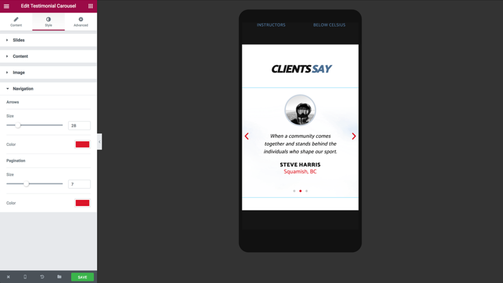
- Change the spread of images in an image carousel to present fewer images per rotation
- Making buttons full width to make it easier to click on mobile devices
Fast responsive web design equals success for your business
As we have seen, it is certainly possible to design a responsive website from scratch without once touching CSS code. The process I described can shave off hours from your workflow and allows you to deliver a perfect website that looks just right on all devices and screens.
If you want to see how we design a full one-page responsive website from scratch, including making all the mobile steps discussed in this article, check out the 25-minute video tutorial we've created. The last 10 minutes deal specifically with mobile adjustments.
*Ben Pines is the CMO of Elementor. He has been in the online marketing industry for over 10 years, specializing in content marketing. WordPress has been Ben's platform of choice since the time when it was only used to blog.*