A landing page is all about usability and design. To please users and increase conversion, make sure you avoid these fails while landing your new project.
Let's imagine:
You've built a stellar landing page for promoting your small business.
Do you like the conversion it gives? Probably, but you think it could be better and more effective, don't you?
Yes, it could.
But what could you do to make it more effective?
There's no limit to perfection: the more we try, the more we learn and understand. The main thing is to avoid making the same mistakes again.
With all those guides, manuals, tips, and instructions on writing and designing a landing page, we still fail. Sometimes we don’t even understand where exactly we failed. And that’s what we’ll cover: your landing page fails to avoid in order to grow conversion sky-high.
Fail: It does not pass the blink test
“What is that?” you may ask.
It's simple: A person needs 50 milliseconds to make the first impression on something, and your landing page is not an exception. Visitors will judge it in the blink of an eye.
How do you know if your landing page can pass the blink test? Consider using more relevant imagery, engaging headlines, and clear calls-to-action.
Fail: Too much text, too many fonts
Some designers go crazy with fonts, following the rule “more is better.” Forget about it! Two fonts that work well together will be the best choice.
The same story comes with texts. Yes, you want to tell your visitors how awesome you are, add more selling points, and celebrate all the benefits of your product. The ugly truth of life is... no one will read them: you have five seconds to convince a visitor to stay.
How to do that?
- Avoid long paragraphs
- Give a clear unique selling proposition (USP)
- Use images
- Use bolded words
- Use headings
- Use bullet points
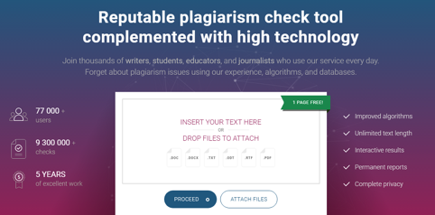
Look at the PlagiarismCheck.org landing page for an example of how to do things well: fewer words, more points.
Fail: It does not have images
An image is worth a thousand words—it appeals to the eye, communicates content, and encourages higher conversion rates.
What can be worse than a landing page with no image? A landing page with the wrong image!

Wrong images tell your customers the wrong story, so you should pay much attention to them. To find out how to pick out the right images for landing pages, check this article from Kick Off Labs.
The most common mistakes here:
- You think that any photo will work well
- You use wretched stock photos (As a rule, they all are unspecific and irrelevant, but it is possible to find good ones!)
- You use default Photoshop effects (they make your landing page look like it was made in ancient times)
When building your landing page, try to use a picture that will tell your visitors what you do. Certainly, it should be eye-catching and inspiring, as well as give an impression your work will solve all their problems if they choose you.
Fail: It doesn't have USP and hides your benefits
Your unique selling position (USP) is the first thing a visitor should notice on your landing page.
Let people know what differentiates you from your competitors. Write down four or five USPs, choose the best one for a headline, and use the others to make a list of your key benefits.
Fail: It doesn't explain what you do
Your landing page should communicate its purpose. If the headline or subheadings do not help visitors understand what you do, say goodbye to the conversion.
It was the problem Groove had: their landing page did not give any exact information about services, and visitors could not understand what problem they would solve if decided to use Groove's services.
Here is what their landing page looked like:
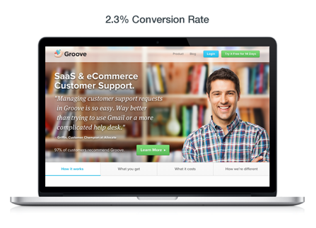
Check what they've done to grow conversion 100 percent by rethinking their web page design:
- New headline and subheadings
- New colors
- Clearer navigation
- Video versus stock photos
Tip: Answer the question “What problem am I solving?” They should see what your site is about, what your prices are, how much time they will need to subscribe or place an order, and what kind of products or services you offer.
Fail: It has a wrong CTA color
Did you know the color of your CTA could influence your conversion rate? It needs to be a different, contrasting color to your landing page. Different colors incite different emotions. Keep it in mind while choosing them:
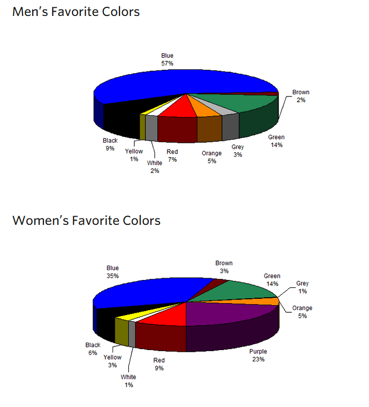
Blue = Professionalism, trust, security; it's used by many popular brands; popular among men
Green = “Go,” and it's the easiest one for the eye to process; good for CTA buttons
Red = Passion; can make people behave in a way they don't usually act; useful for responses
Purple = Femininity; try this for a primarily female audience
Fail: It isn't ready for mobile gadgets
Does your landing page make mobile visitors swipe-swipe-swipe and scroll-scroll-scroll? Is your landing page image too large to see it on a mobile screen? It doesn't let visitors access your entry form, and it doesn't make it easy for them to find the CTA, does it?
A yes to at least one of those questions is a sign you are doing something wrong. Think about mobile traffic to your page, make sure you follow the best practices of mobile marketing and optimize your landing page on multiple screens resolutions.
Why do you need this?
- About 60 percent of online traffic comes from mobile devices, and Google's Mobilegeddon shows us all the advantages of making web pages mobile-friendly.
- 90 percent of mobile users try several screens to accomplish their tasks in time. It means, that one person could start checking your page on a tablet, continue on a smartphone, and finish on a laptop. So, make it easier for them.
Fail: You forget about it after going live
Just because your landing page is live doesn’t mean it’s going to do all the work for you. Sky's the limit, and your current conversion will never be enough; so, your task is to work toward more effective designs and efficient layouts.
What can you do?
Keep testing your landing page, as you never know what works for your target audience until you give it to them. A/B tests can help a lot.
Show them different variants, test your landing page, redesign it to choose the best and most effective one. As Steve Jobs said, “A lot of times, people don't know what they want until you show it to them.”
Show your landing page, but don't forget to listen to your customers, too.
Lesley J. Vos is a content creator and blogger contributing to publications on education, digital marketing, and self-development. Feel free to contact her on Twitter at @LesleyVos.