Having a great landing page is indicative of how much a company values its audience and effectively generates leads. A landing page needs to exude a memorable first impression that best represents your brand and your industry.
Depending on your business type, there are so many kinds of landing pages conducive for different audiences. Some could be simple, some could be overstimulating. In any case, as website templates become more advanced and customized, they allow companies to be as creative as they want when it comes to attracting consumers to their websites and giving them a place to explore for a while.
Check out the seven best landing page examples that will inspire your own website design for 2020.
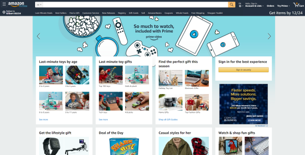
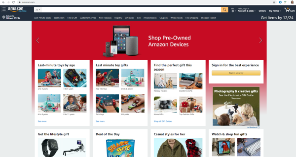
Amazon
So much to do, so much to see, so little time. Considering how close we are to Christmas, Amazon has taken its landing page up a notch to appeal to the interest of holiday shoppers. Its landing page is chock-full of last-minute gift ideas before you even log in. It has strategically placed a revolving carousel at the top that advertises and links to its many proprietary products including Amazon Prime, Amazon devices and Amazon Music. Ensuring its site supplies every item known to mankind, the page funnels its visitors to the array of endless gift ideas that I’m confident would compel someone to keep buying gifts even if they were done with their Christmas shopping in August. The power of suggestion is truly in overdrive here.
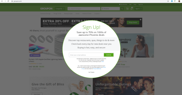
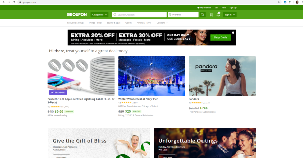
Groupon
Upon reaching Groupon’s website, visitors are immediately greeted by an interstitial encouraging them to find great deals in their area by signing up with their email address. It’s the perfect way to generate leads. The site is also programmed with geolocation services so it automatically detects which area you’re searching from. Once you enter your email address, you get access to its landing page that encourages visitors to treat themselves to a great deal and proceeds to list the best deals of the day below. The site is clean, well laid out, and easy to navigate on a desktop or mobile device.
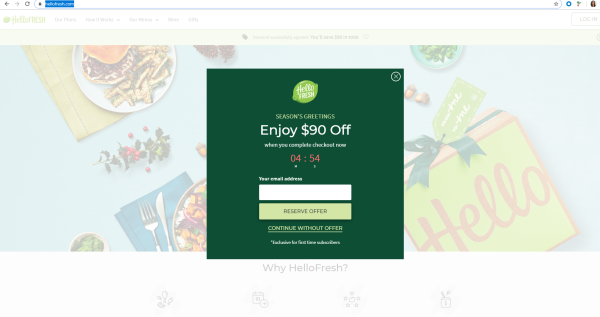
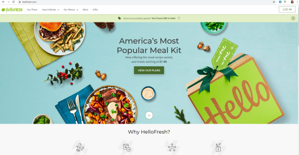
HelloFresh
HelloFresh is another website that greets its visitors with an interstitial, only this time, the pressure’s on, as you have a five-minute countdown to enter your email and complete your order if you want to get $90 off your first purchase. It also gives you the choice to continue without the offer. Another brilliant way to generate leads.
Should someone continue without the offer, HelloFresh’s homepage is colorful, playful, organized and includes a call-to-action (CTA) in the middle of the page that gives you easy access to their different meal plans.
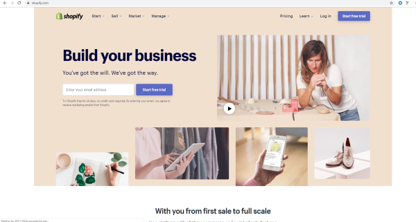
Shopify
Shopify’s landing page doesn’t pull any punches; its slogan is right there at the top: “Build your business. You’ve got the will. We’ve got the way.” It also gives its visitors the chance to start a free 14-day trial with no credit card required, just an email address–another subtle lead gen tool. If users aren’t sure about signing up, Shopify’s homepage also offers a demo video at the top that explains how its business works, leaving no room for ambiguity for someone who's thinking about launching their own e-commerce business. The menu at the top is also well labeled and the warm color of the background is quite inviting and calming to someone who is taking on such a daunting task of putting their small business online.
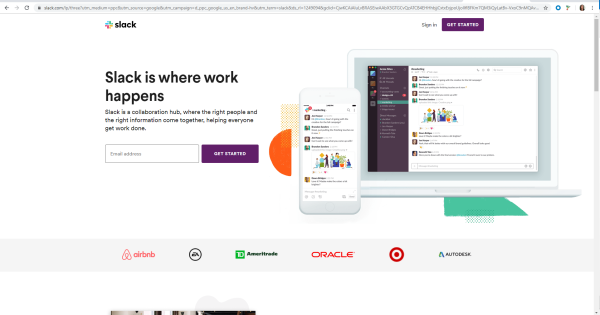
Slack
Slack is a great platform with a great landing page. Getting started is easy, as it provides a field for you to enter your email address and from there, you can create your account, whether it’s for yourself or on behalf of your company. The hero image provides what the program looks like on a desktop and on a mobile device, demonstrating how versatile it is. It also provides a list of other big-name brands that collaborate with Slack. Scrolling just below that divider are instructions for how to use the platform by creating different channels and integrating it with other programs you use daily. The site’s appearance is clean, slick, and very easy to navigate.
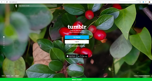
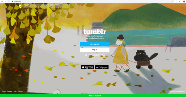
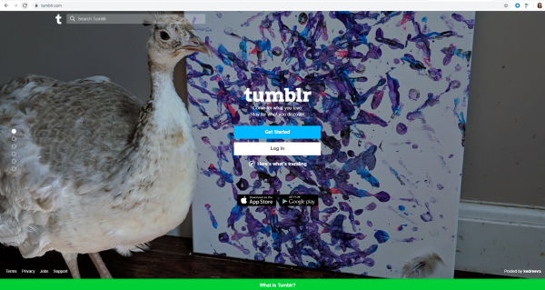
Tumblr
I was blown away by Tumblr’s landing page for a few reasons. Mainly, every time I refreshed the page, it loaded a different background image. I included three examples to demonstrate the variety of artwork that it put on display. It’s very pleasing to the eye and I just love the rotating concept.
Secondly, it’s a very minimalist design, as their CTAs stand out among the artwork. The form is also very short, as fewer fields yield more leads. Visitors can also scroll down the page to get a glimpse of just how easy it is to use Tumblr and what users can expect from its site. It’s colorful, it’s simple, it’s organized, and its last page at the bottom reflects the first page with the same CTAs, giving users yet another chance to sign up after the detailed overview.
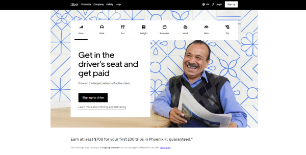
Uber
Uber’s landing page is very straightforward, giving drivers who want to sign up easy access for creating an account with a CTA sign up button on the homepage. The navigation bar at the top is also clearly labeled–if users need a ride, they can choose Ride, if they want to order food, they just go to the Eat section to get something delivered, etc. Each landing page includes a prominent CTA button that creates many conversion possibilities. It’s obviously very different from the app, but it’s still a nicely laid out website designed for a desktop that includes imagery that illustrates each landing page’s scenario. Much like Groupon, Uber is also programmed with geolocation services, for obvious reasons, but it still creates an individual experience that saves you the trouble of making sure you’re searching for services in the correct area.